GOLDFINGER
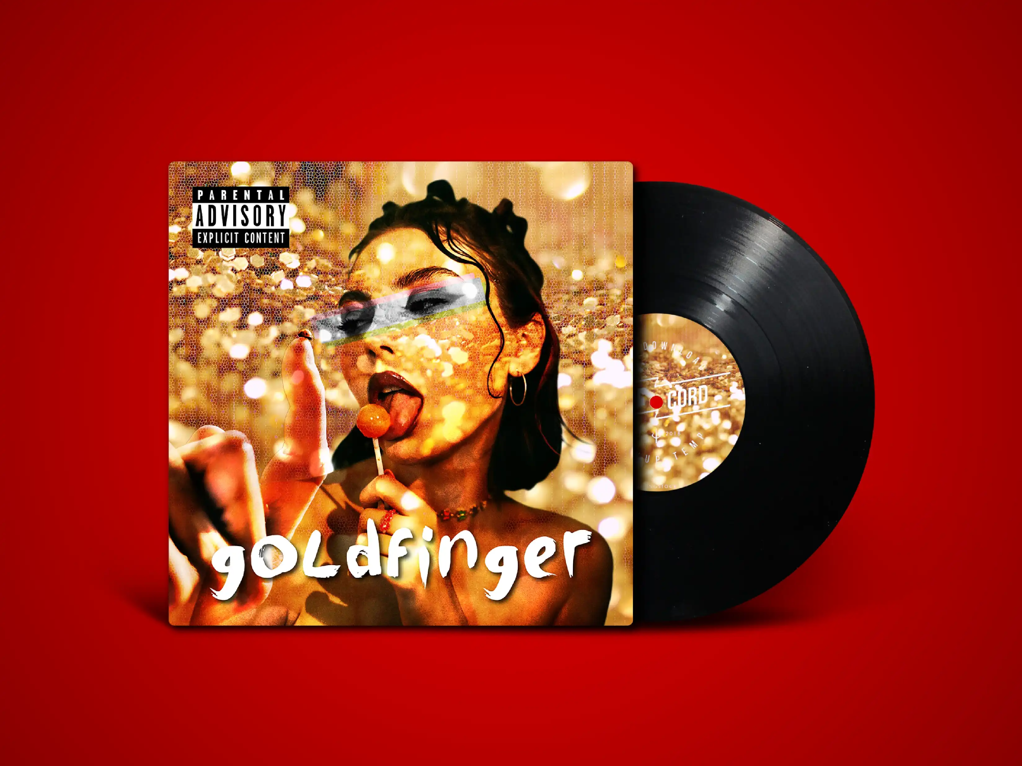
Goldfinger wanted the artwork to feel like a return, not a repeat. The goal was to capture the band’s ska roots with a fresh visual attitude that feels playful, stylish, and unmistakably their own.
Year
09.21
Scope
Visual Identity, Product Packaging
Software
Photoshop
Timeline
2 Weeks
Golden Ska Revival
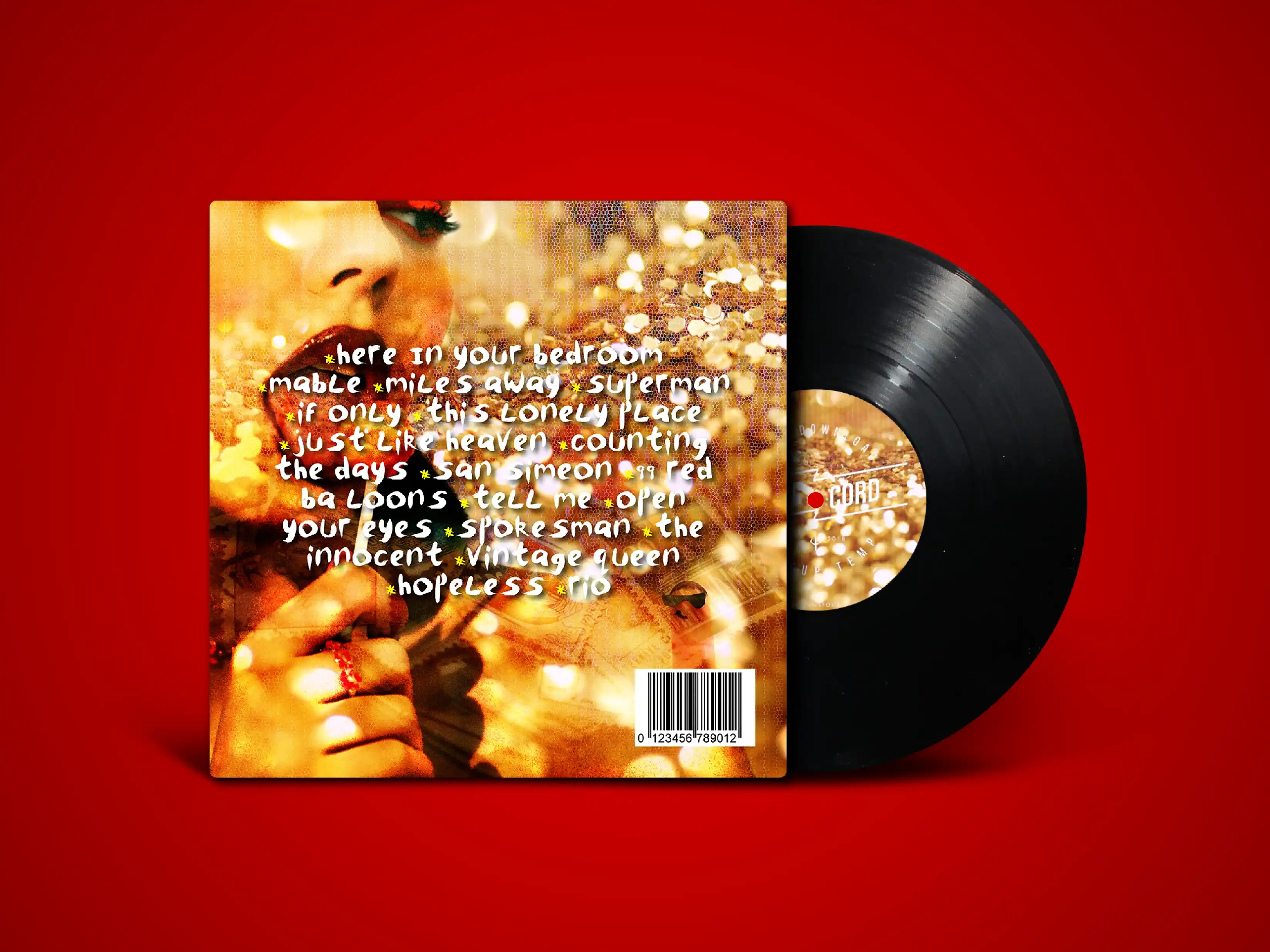
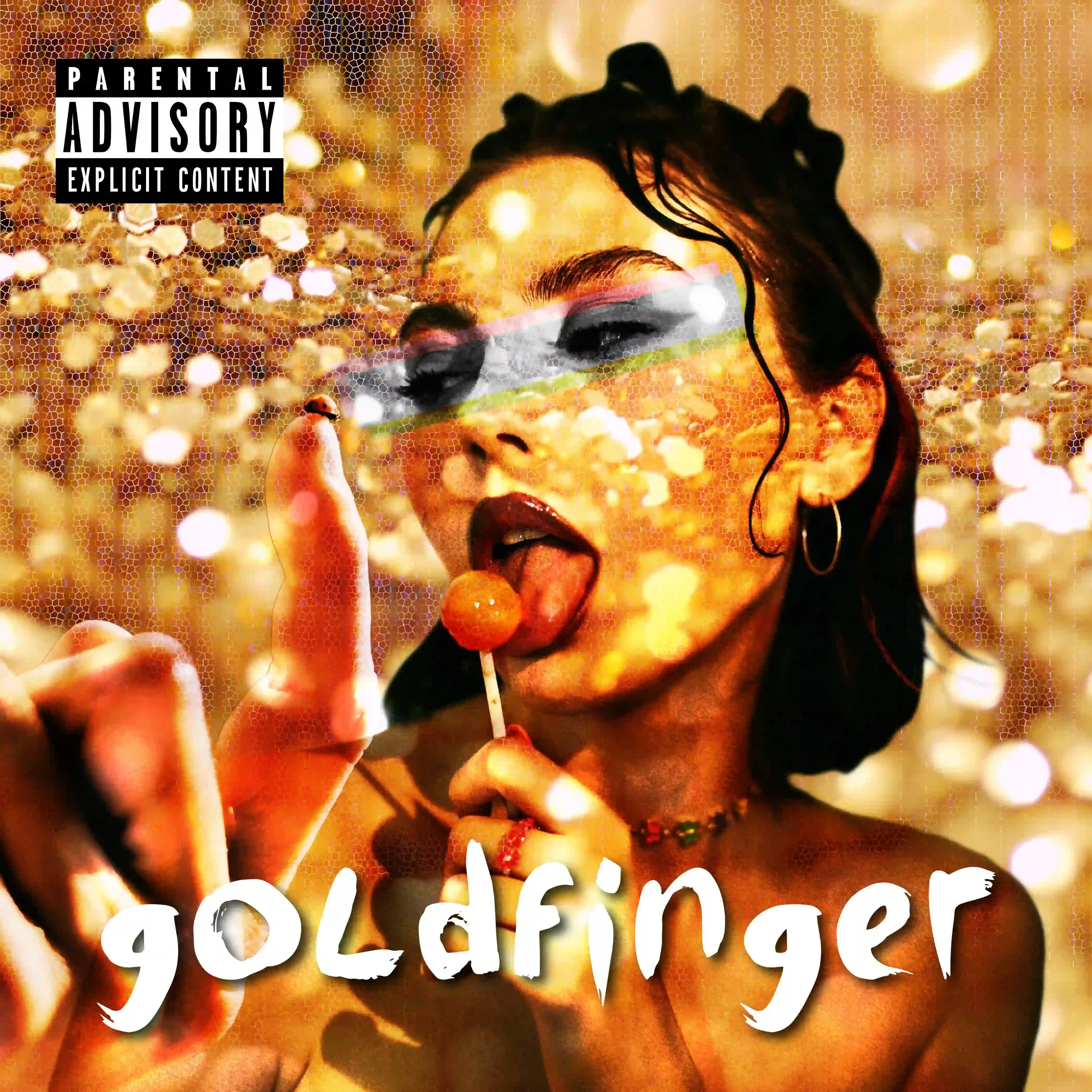
We partnered with Goldfinger to design the artwork for their self-titled album, creating a visual identity that matches the record’s playful rhythm and back-to-basics energy. The cover features a cute punk girl experiencing her first real hit of ska-punk sound, giving the concept a character-driven twist with plenty of attitude. A gilded gold palette is contrasted by a sharp lipstick red accent, adding warmth, glamour, and a little danger to the composition. The result feels energetic and memorable, balancing punk charm with a polished finish that reflects both the band’s history and their lighter, more playful nature.